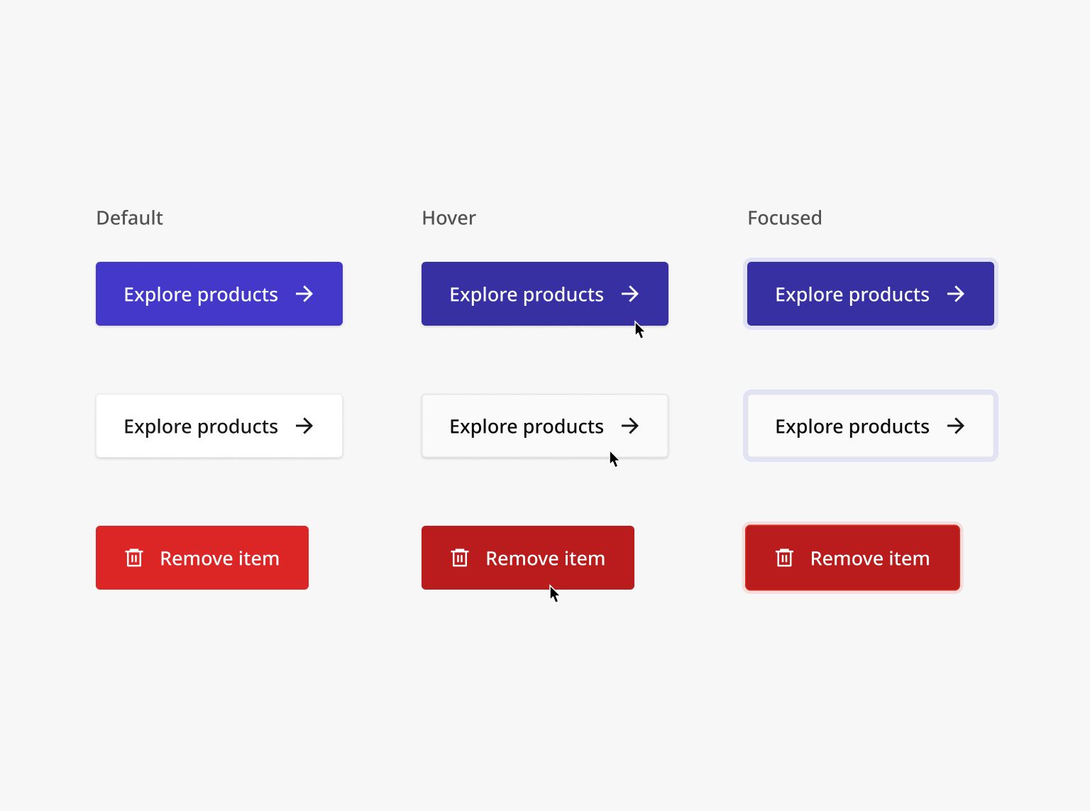
Button Component
+100 rep
Loading...
Get started
While working on project
After completion

1/2
Project brief
In this challenge, you will build a versatile button component that is part of a design system. These buttons will be used across various challenges and apps found within the platform, providing consistency throughout the user interface.
Implementation requirements
- Design fidelity: Aim to follow the design as closely as possible. All elements in the design should be present, using the specified text color, font size, font weight, spacing, dimensions, etc.
- User interaction: While not needed for this challenge, buttons should be easily extended to respond to user interaction, allowing for future integration with various functions and back end systems.
- Cross-browser compatibility: Check that your solution works for major browsers including Chrome, Firefox, and Safari.
- [Stretch goal] Accessibility: Buttons should meet AA standards of WCAG 2.1, including keyboard navigation and ARIA attributes for screen readers
- Icon buttons should have
aria-labelattributes since there's no visible label. - Buttons should be focusable via the Tab button.
- Icon buttons should have
Component properties
- Variants: Collection of buttons should have distinct visual styles corresponding to different situational needs – primary, secondary, tertiary, destructive and links.
- States: Implement and style buttons to reflect different states – normal, hover, focus, and disabled.
- Sizes: For each button style and state, we have 4 sizes – Medium, Large, Extra large and 2 Extra large
- Icons: Left icon only, right icon only, icons on both sides, or icon-only
Tips
- Identify how you can reuse and compose your CSS classes together to produce the various combinations of button variants, states, sizes, and icons.

1/2
Resources provided
Design files for desktop, tablet and mobile
High resolution image assets
README file
Starter code with content copy
Style guide for typography, colors and spacing
Support you can expect
Official guides & resources
Development guides written & curated by Sr engineers at Big tech, such as:
Learn from good code
We recommend well-rated submissions using the same stack for your reference
Ask any questions in community
Have any doubts or need help? Ask in the community and discuss with others.
