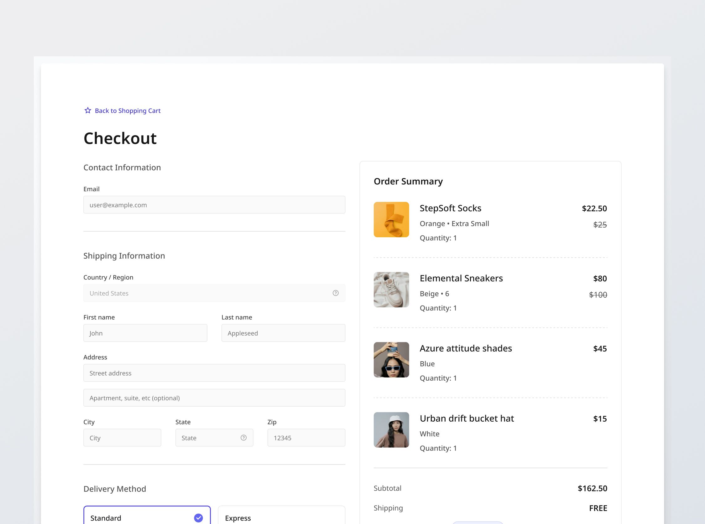
Checkout Section
Premium
Project brief
In this challenge, you will develop a fully functional and responsive one-page checkout interface for a fictional e-commerce platform. You will be provided with designs that have been adapted for mobile, tablet, and desktop interfaces. You will also be provided with data corresponding to product listings, as well as a sample order that you will display in the checkout.
As per standard one-page checkouts, the interface should allow users to add their contact information, shipping information, delivery method and payment method in a secure manner. When you work on the E-commerce Website challenge, you will have to fetch a user's shopping cart and create the order upon successful checkout to be shown on the Order Success Page.
Implementation requirements
This is a complex challenge with many parts, please read the requirements carefully.
Fields and validation
The table below describes the fields required in the checkout form, as well as their validation. Here is what some of the columns mean:
- Allowed values: Refers to the types of values that the user can type into the field.
- Validation: Refers to the validation to be done when the field is filled and blurred. All validation should be triggered at once on submission, with focus placed on the first field that has validation errors.
By default, all fields are required except for "Address line 2". The default validation message is "[Field name] is required".
| Label | Placeholder | Allowed values | Validation | Validation message |
|---|---|---|---|---|
| user@example.com | Strings | Email matches the standard email format | Please enter a valid email address. | |
| Country | N/A | List of countries | N/A | N/A |
| First name | John | String | Default | Default |
| Last name | Appleseed | String | Default | Default |
| Address line 1 | Street address | String | Default | Default |
| Address line 2 | Apartment, suite, etc (optional) | String | Default | Default |
| City | City | String | Default | Default |
| State | State | List of states | Default | Default |
| Zip code | Zip code | Numbers | Default | Default |
| Card number | 1234 1234 1234 1234 | Numbers | Default | Default |
| Cardholder name | Full name on card | String | Default | Default |
| Expiry | MM / YY | Numbers | Cannot be before current date | Enter a valid expiration date |
| CVV | CVV | Digits | Default | Default |
Other field requirements
- [Stretch goal] Detect payment type: For the "Card number" field, it is common to detect the card type and display the logo of the card e.g. Mastercard, Visa or AMEX.
- [Stretch goal] Address autocomplete: Many e-commerce checkouts implement address autocomplete using location APIs like those provided by Google Maps. The user experience is further improved by pre-filling other related fields like City and State with the autocomplete address.
Order summary section
- Order summary: Populate information according to the sample order given to you. You may assume shipping is always free.
- Default order: Latest item added to cart first.
- Item denomination: Each product variant in the order should be displayed separately instead of bundled into 1 product. For e.g., if I added both Orange and Pink StepSoft socks, they should be displayed as separate rows.
- List price vs Sale price: If there is a platform discount available, display the list price with a strikethrough. Else, display only the list price.
- Coupon discount: If there is a coupon applied to the order, display the "Coupon discount" row, it shouldn't be shown otherwise.
Data handling and transactions
- [Stretch goal] Integration with actual payment gateway: Integrating with a payment gateway like Stripe is usually free, with fees incurred upon transaction. You are recommended to try it out as part of practice. You can use the standard test card number "4242 4242 4242 4242", which is a well known placeholder used in testing payment transactions (Stripe will not charge you for this because they recognize it as a test card).
- Order confirmation transaction: Upon clicking "Confirm order", an atomic transaction should be triggered that:
- Checks if there is sufficient stock:
- If there has been a change of stock, you should display a modal as per the provided design for "Insufficient stock". This informs the user that there has been a change in stock.
- If there are still items in the order: After the user clicks "Ok", update the checkout with the new values.
- If there is no longer any items within the order: Bring the user back to cart.
- Payment: Charge to customer's payment method.
- Stock update: Deduct stock in database.
- Order creation: Create order in database.
- If any of the items above fails, the user should be redirected back to the Checkout page to try again later, with the error toast notification "We faced a problem processing your checkout. Please try again or contact us."
- Checks if there is sufficient stock:
General requirements
- Design fidelity: Aim to follow the design as closely as possible. All elements in the design should be present, using the specified text color, font size, font weight, spacing, dimensions, etc.
- Interactivity:
- Button / link states: Implement and style buttons / links to reflect different states - normal, hover, and disabled.
- Input field states: Implement and style input fields to reflect different states - normal, focus filled, disabled, error, error filled, error focused.
- Checkbox states: Implement and style checkboxes to reflect different states - normal, checked, checked- normal-disabled, checked-disabled.
- Selection card states: Implement in normal, hover, focus and selected states.
- Responsive behavior:
- Text size: Should be responsive; font size is larger for wider devices, smaller for narrow devices.
- Responsive layout: The content should stack vertically on smaller screens and align horizontally as the screen width increases.
- Cross-browser compatibility: Check that your solution works for major browsers including Chrome, Firefox, and Safari.
- [Stretch goal] Performance optimization: Code for fast load times with efficient CSS and JavaScript techniques.
- [Stretch goal] Accessibility compliance: Follow best practices for web accessibility, such as using semantic HTML and ARIA roles where necessary, using proper
alttags for images.

Resources provided
Support you can expect
