Loading...
Contact Section
Premium+300 rep
Loading...
Get started
While working on project
After completion

1/4
Project brief
Objective
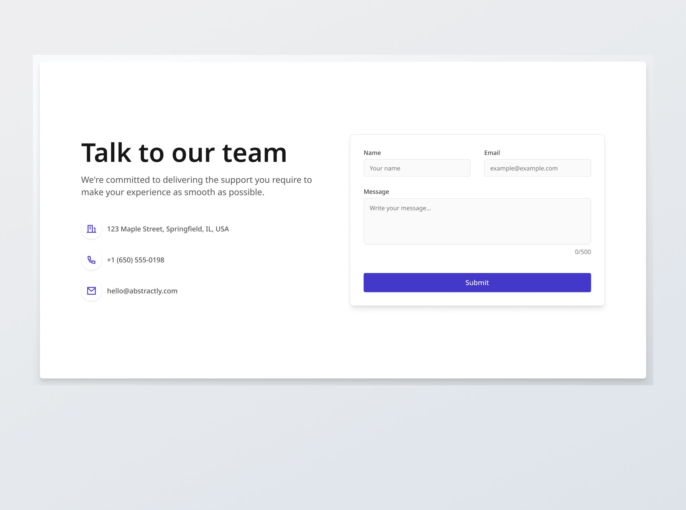
In this challenge, you will build a responsive contact section that allows users to submit their name, email and a message. This challenge will incorporate detailed interactive states and validation features.
Implementation requirements
- Design fidelity: Aim to follow the design as closely as possible. All elements in the design should be present, using the specified text color, font size, font weight, spacing, dimensions, etc.
- Interactivity:
- Email Link: Lead to mailto:hello@abstractly.com.
- Button states: Implement and style buttons to reflect different states - normal, hover, focus, and disabled.
- Input field states: Implement and style input fields to reflect different states - normal, focused, filled, disabled, error, error filled, error focused.
- Real-time character counter: Develop a textarea input field with a real-time character counter and provide a warning cue when the character limit is exceeded.
- Client-side validation: Implement email validation on the client side to catch errors before they reach the server, ensuring a smoother user experience.
- Format check: Validate that the email entered matches the standard email format (e.g.,
name@domain.com), else provide immediate browser feedback. - Required: Ensure the email field is not left blank upon submission attempt, else provide immediate browser feedback.
- [Stretch goal] Customize UX with better error messages:
- Format check: "Please enter a valid email address."
- Required: "Email address is required."
- Format check: Validate that the email entered matches the standard email format (e.g.,
- API submission: On successful validation, the form should submit the data to an API endpoint, handling responses and errors gracefully to inform the user of the submission status:
- Success feedback: After API submission, parse the successful response and confirm submission to the user with "Submission successful! We will get back to you in 3-5 days via email."
- API error response: Handle any API error responses (e.g., 400 Bad Request, 500 Internal Server Error) by displaying an appropriate message such as "Failed to submit. Please ensure your details are correct or try again later." or displaying the error message from the server.
- Responsive behavior:
- Text size: Should be responsive; font size is larger for wider devices, smaller for narrow devices.
- Responsive layout: The layout should reorganize responsively. The content should stack vertically on smaller screens and align horizontally as the screen width increases.
- Placeholders: You may leave the redirection links empty for any unspecified buttons or links.
- Cross-browser compatibility: Check that your solution works for major browsers including Chrome, Firefox, and Safari.
- [Stretch goal] Accessibility considerations: Follow best practices for web accessibility to ensure that all form elements are labeled correctly and are navigable using keyboard controls. Provide appropriate ARIA labels for screen readers.

1/4
Resources provided
Design files for desktop, tablet and mobile
High resolution image assets
README file
Starter code with content copy
Style guide for typography, colors and spacing
API specifications and sample data
Support you can expect
Official guides & resources
Development guides written & curated by Sr engineers at Big tech, such as:
Learn from good code
We recommend well-rated submissions using the same stack for your reference
Responsive solution built with React
React
Tailwind
Nextjs

Ask any questions in community
Have any doubts or need help? Ask in the community and discuss with others.
18
Anna Gilbert ·
Software Engineer @ Stripe
4 YOE