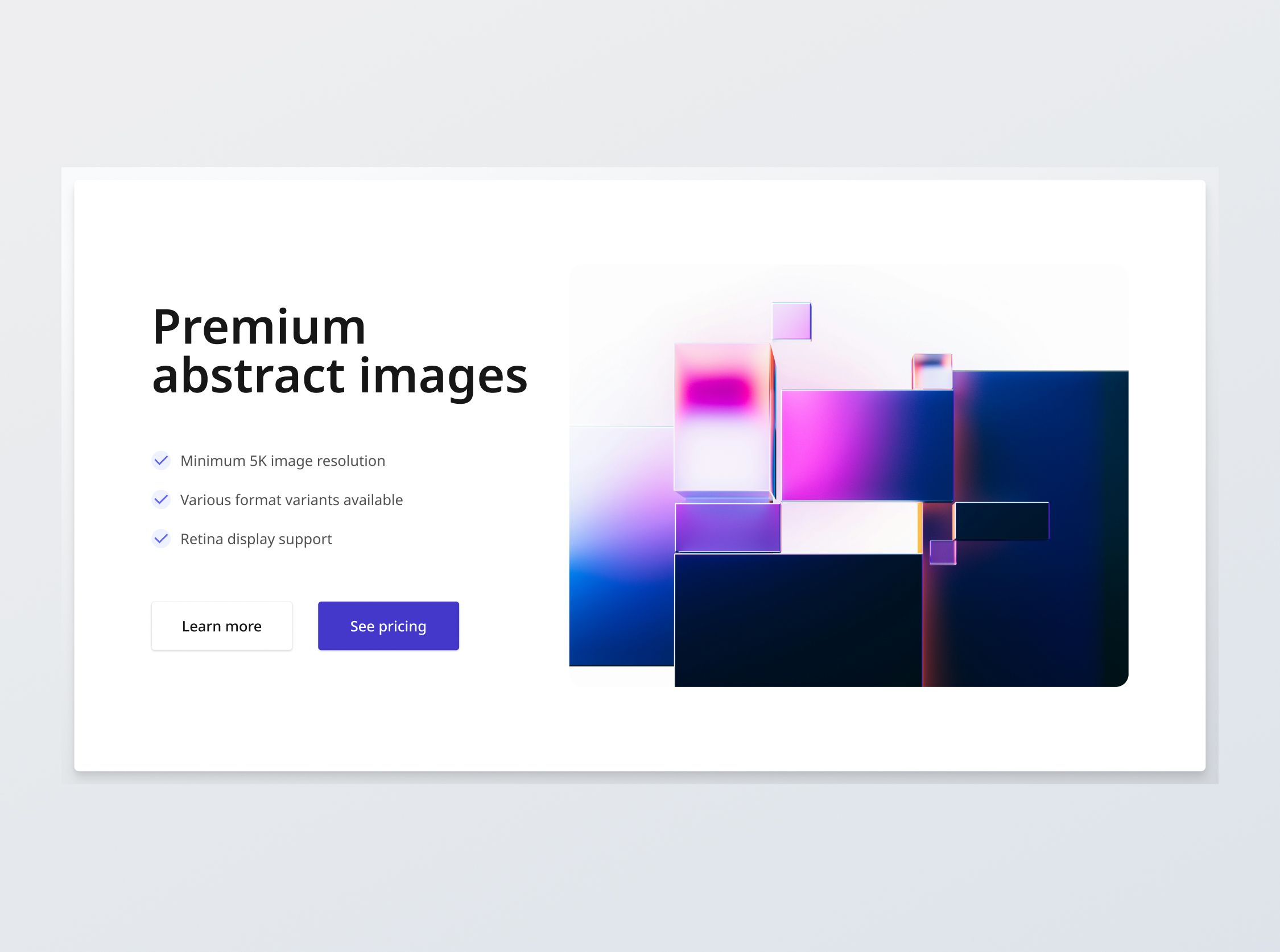
Hero Section (Feature bullets)
+100 rep
Loading...
Get started
While working on project
After completion

1/3
Project brief
In this challenge, you will develop a responsive hero section based on the provided designs for desktop, tablet, and mobile views. The hero section will contain an image as well as a few bullet points outlining the key features.
Implementation requirements
- Design fidelity: Aim to follow the design as closely as possible. All elements in the design should be present, using the specified text color, font size, font weight, spacing, dimensions, etc.
- Interactivity:
- Button states: Implement and style buttons to reflect different states - normal, hover, focus and disabled.
- Responsive behavior:
- Text size: Should be responsive; font size is larger for wider devices, smaller for narrow devices.
- Responsive layout: The layout should reorganize responsively. The content should stack vertically on smaller screens and align horizontally as the screen width increases.
- Image size: The image resizes to fill the available width on tablets and mobile viewports.
- Element adaptability: Ensure that text elements and images resize appropriately without distortion or loss of quality.
- Placeholders: You may leave the redirection links empty for any unspecified buttons or links.
- Cross-browser compatibility: Check that your solution works for major browsers including Chrome, Firefox and Safari.
- [Stretch goal] Performance optimization: Code for fast load times with efficient CSS and JavaScript techniques.
- [Stretch goal] Accessibility and semantics: Follow best practices for web accessibility, such as using semantic HTML and ARIA roles where necessary and using proper
alttags for images.

1/3
Resources provided
Design files for desktop, tablet and mobile
High resolution image assets
README file
Starter code with content copy
Style guide for typography, colors and spacing
Support you can expect
Official guides & resources
Development guides written & curated by Sr engineers at Big tech, such as:
Learn from good code
We recommend well-rated submissions using the same stack for your reference
Ask any questions in community
Have any doubts or need help? Ask in the community and discuss with others.
