Navbar (E-commerce)
+300 rep
Loading...
Get started
While working on project
After completion

1/3
Project brief
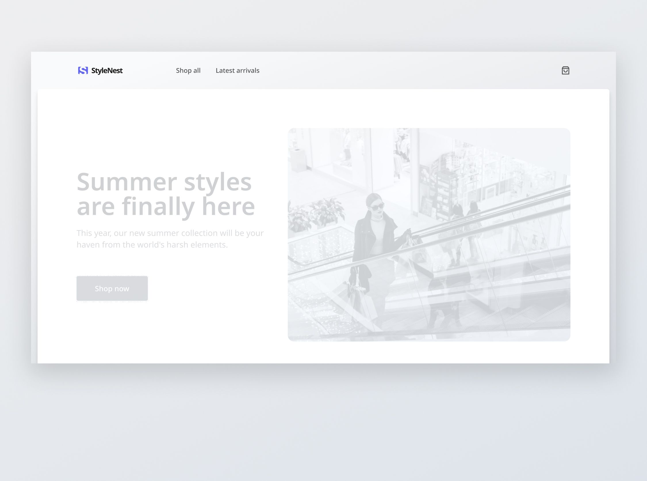
In this challenge, you will develop a minimal navigation bar that is typically found on e-commerce websites using the supplied designs that have been adapted for desktop, tablet, and mobile views.
In addition to standard navigation options, there should also be a cart icon, which displays the current item count and reflects the current number of items in a user's cart.
Implementation requirements
- Design fidelity: Aim to follow the design as closely as possible. All elements in the design should be present, using the specified text color, font size, font weight, spacing, dimensions, etc.
- Interactivity:
- Links & Icon-buttons: Implement and style interactable components like links and icon buttons to reflect different states - normal, hover, and focus.
- Buttons: Implement and style buttons to reflect different states - normal, hover, and disabled.
- Responsive behavior:
- Text size: Should be responsive; font size is larger for wider devices, smaller for narrow devices.
- Adaptive hamburger menu: Hamburger menu should be implemented for tablet and mobile views. The menu should be shown once the hamburger icon button is tapped on.
- Transition on responsive breakpoints: The transition from full navigation bar on desktop to hamburger menu on tablet and mobile should be fluid and natural, occurring at the appropriate breakpoints for tablet and mobile.
- Placeholders: You may leave the redirection links empty for any unspecified buttons or links.
- Cross-browser compatibility: Check that your solution works for major browsers including Chrome, Firefox, and Safari.
- [Stretch goal] Performance across devices: Ensure that the navigation bar and hamburger performs well on all devices, with quick load times and smooth transitions.
- [Stretch goal] Accessibility: Build the navigation bar and hamburger menu with a focus on accessibility, making sure that it complies with WCAG guidelines and provides a fully accessible user experience.

1/3
Resources provided
Design files for desktop, tablet and mobile
High resolution image assets
README file
Starter code with content copy
Style guide for typography, colors and spacing
Support you can expect
Official guides & resources
Development guides written & curated by Sr engineers at Big tech, such as:
Learn from good code
We recommend well-rated submissions using the same stack for your reference
Ask any questions in community
Have any doubts or need help? Ask in the community and discuss with others.
