Product Reviews

Project brief
In this challenge, you will develop a responsive product reviews component based on the supplied designs, which have been adapted for desktop, tablet and mobile views.
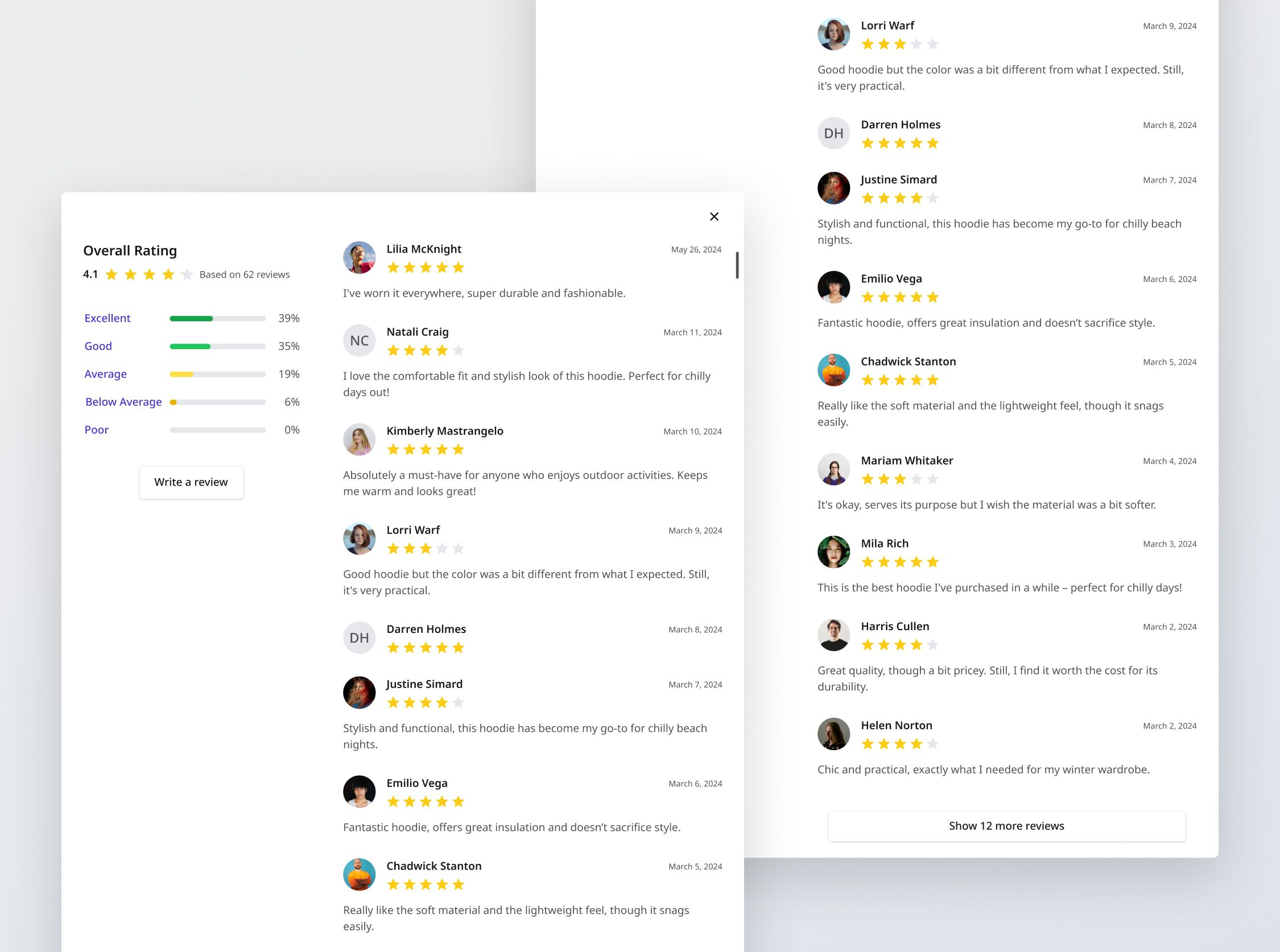
This interactive component will display user reviews for a specific product including a summary of the ratings. It will also allow users to filter reviews by rating, and display a pagination component when there are too many reviews on the page.
You will be provided with data relevant to this project, including product listings available on the fictional e-commerce platform, as well as their reviews.
In future, you can connect the "Write a review" button to the "Write a review" challenge (coming soon). If you're not intending to build it, you can leave the button out.
Implementation requirements
Review list
Display reviews for the current product
- Default sorting: Latest review first
- Pagination:
- Page size: 12 for desktop, 10 for mobile and tablet.
- "See 'X' more reviews": Button appears when there are more reviews to show. If the user is viewing the last set of reviews, the button should become hidden. The label on the button should dynamically reflect the number of reviews that will be loaded upon clicking. For example, if there are only 5 reviews left to show, the button should read "Show 5 more reviews".
- Empty state: If there are no reviews for the current filters, an empty state should be displayed, as per the provided designs.
Review item
- Profile picture: If present, display image. Otherwise, display letters of up to first 2 initials.
- Rating stars: Display filled stars according to the rating given.
- Review: Display review if given. The user is allowed to give a rating without writing a review e.g. Darren Holmes for Voyager Hoodie product.
- Date of review: The date format should be parsed or displayed in the
MMMM d, yyyypattern, whereMMMMis the full month name,dis the day of the month without a leading zero for single-digit days, andyyyyis the four-digit year.
Review summary
- Overall rating: Calculated by averaging all ratings for the product.
- Rating bands: Summarize the percentage of each rating band of reviews.
- Filtering by rating bands:
- Users can click on a rating bar to show only reviews matching the selected rating. Users should return to the first page of reviews if they were not on the first page.
- Implement the rating bar review states - Normal, Hover and Filter active.
- Only one rating can be selected at any one time.
- When a filter is active, a "Clear filter" button should appear, which allows users to clear all active filters.
General requirements
- Design fidelity: Aim to follow the design as closely as possible. All elements in the design should be present, using the specified text color, font size, font weight, spacing, dimensions, etc.
- Button / link states: Implement and style buttons / links to reflect different states - normal, hover, and disabled
- Responsive behavior:
- Text size: Should be responsive; font size is larger for wider devices, smaller for narrow devices.
- Responsive layout: The content should stack vertically on smaller screens and align horizontally as the screen width increases.
- Cross-browser compatibility: Check that your solution works for major browsers including Chrome, Firefox, and Safari.
- [Stretch goal] Performance optimization: Code for fast load times with efficient CSS and JavaScript techniques.
- [Stretch goal] Accessibility and semantics: Follow best practices for web accessibility, such as using semantic HTML and ARIA roles where necessary and using proper
alttags for images.

