Loading...
Team Section
Premium+100 rep
Loading...
Get started
While working on project
After completion

1/3
Project brief
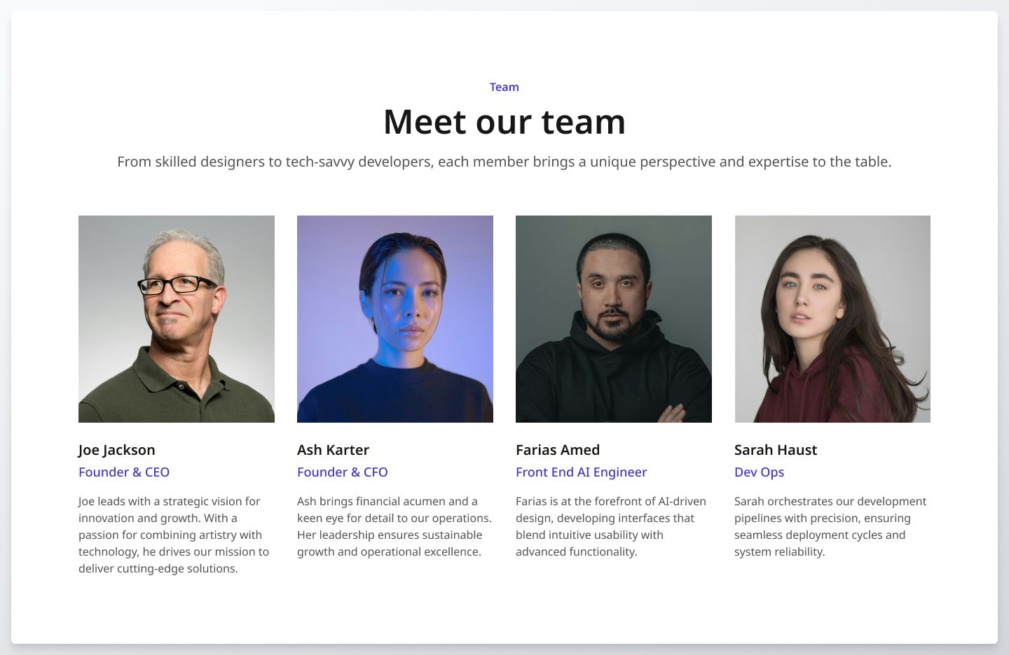
In this challenge, you will develop a responsive team section with the provided design mockups for mobile, tablet, and desktop, showcasing team members with their photos, names, titles, and brief descriptions.
This challenge will require coding a layout that reflows team profiles based on the device's screen size to ensure a seamless user experience.
Implementation requirements
- Design fidelity: Aim to follow the design as closely as possible. All elements in the design should be present, using the specified text color, font size, font weight, spacing, dimensions, etc.
- Responsive behavior:
- Text size: Should be responsive; font size is larger for wider devices, smaller for narrow devices.
- Responsive layout: The layout should be flexible and responsive, displaying lesser team profiles on smaller devices like mobile and tablet, and more team profiles on desktops. The content should stack vertically on smaller screens and align horizontally as the screen width increases.
- Element adaptability: Ensure that text elements and images resize appropriately without distortion or loss of quality.
- Cross-browser compatibility: Check that your solution works for major browsers including Chrome, Firefox, and Safari.
- [Stretch goal] Performance optimization: Optimize image assets and code for quick load times, ensuring a smooth and responsive user experience.
- [Stretch goal] Accessibility and semantics: Follow best practices for web accessibility, such as using semantic HTML and ARIA roles where necessary and using proper
alttags for images.

1/3
Resources provided
Design files for desktop, tablet and mobile
High resolution image assets
README file
Starter code with content copy
Style guide for typography, colors and spacing
Support you can expect
Official guides & resources
Development guides written & curated by Sr engineers at Big tech, such as:
Learn from good code
We recommend well-rated submissions using the same stack for your reference
Responsive solution built with React
React
Tailwind
Nextjs

Ask any questions in community
Have any doubts or need help? Ask in the community and discuss with others.
18
Anna Gilbert ·
Software Engineer @ Stripe
4 YOE