Text Input Component
+100 rep
Loading...
Get started
While working on project
After completion

1/2
Project brief
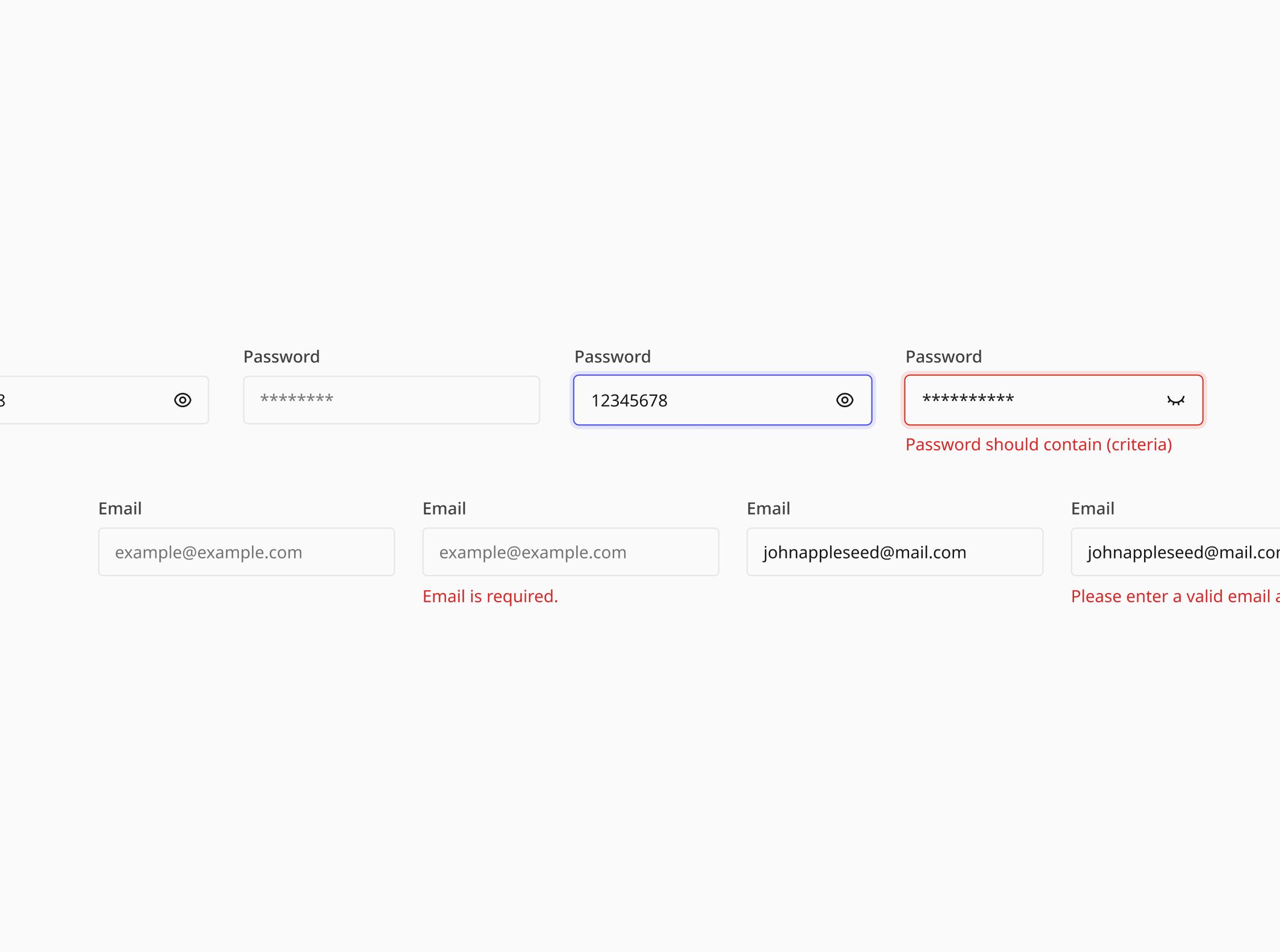
In this challenge, you will build a versatile text input component as part of a design system. Text input components are essential for forms, data entry interfaces, and other interactive elements across various projects and apps found within the platform.
Implementation requirements
- Design fidelity: Aim to follow the design as closely as possible. All elements in the design should be present, using the specified text color, font size, font weight, spacing, dimensions, etc.
- Cross-browser compatibility: Check that your solution works for major browsers including Chrome, Firefox, and Safari.
- [Stretch goal] Accessibility: Text Input components should meet AA standards of WCAG 2.1, including keyboard navigation and ARIA attributes for screen readers.
- Clicking on the label should focus on the
<input>. - Hint text / error message is associated with the
<input>via the appropriatearia-attributes.
- Clicking on the label should focus on the
Component properties
- Customizable: The component should be allow for customizing of the label, placeholder, hint text, error message.
- Icons: Optional icons can be added at the front or back or both sides of the input field.
- States: The follow states should be supported: Normal, Filled, Focused, Disabled, Error and other reasonable combinations.

1/2
Resources provided
Design files for desktop, tablet and mobile
High resolution image assets
README file
Starter code with content copy
Style guide for typography, colors and spacing
Support you can expect
Official guides & resources
Development guides written & curated by Sr engineers at Big tech, such as:
Learn from good code
We recommend well-rated submissions using the same stack for your reference
Ask any questions in community
Have any doubts or need help? Ask in the community and discuss with others.
