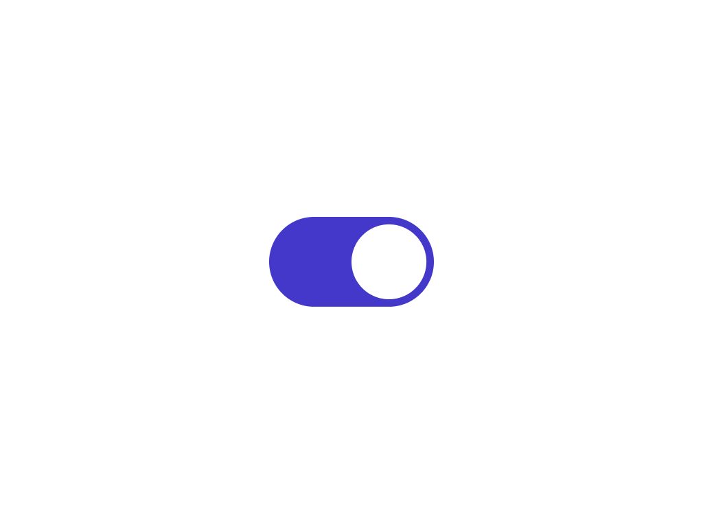
Toggle Component
+100 rep
Loading...
Get started
While working on project
After completion
1/2
Project brief
In this challenge, you will build a versatile toggle component as part of a design system. These components will be essential for forms, data entry interfaces, and other interactive elements across various projects and apps found within the platform.
Component states, variants, and properties
- Sizes: Small and medium.
- States: Implement and style the component to reflect different states – initial/default, hover, focus, and disabled.
Implementation requirements
- Design fidelity: Aim to follow the design as closely as possible. All elements in the design should be present, using the specified text color, font size, font weight, spacing, dimensions, etc.
- Toggling: Clicking on the toggle element should toggle between the active and inactive states.
- Cross-browser compatibility: Check that your solution works for major browsers including Chrome, Firefox, and Safari.
- [Stretch goal] Performance optimization: Optimize image assets and code for quick load times, ensuring a smooth and responsive user experience.
- [Stretch goal] Accessibility and semantics: Follow best practices for web accessibility, such as using semantic HTML and ARIA roles where necessary and using proper
alttags for images.
1/2
Resources provided
Design files for desktop, tablet and mobile
High resolution image assets
README file
Starter code with content copy
Style guide for typography, colors and spacing
Support you can expect
Official guides & resources
Development guides written & curated by Sr engineers at Big tech, such as:
Learn from good code
We recommend well-rated submissions using the same stack for your reference
Ask any questions in community
Have any doubts or need help? Ask in the community and discuss with others.


