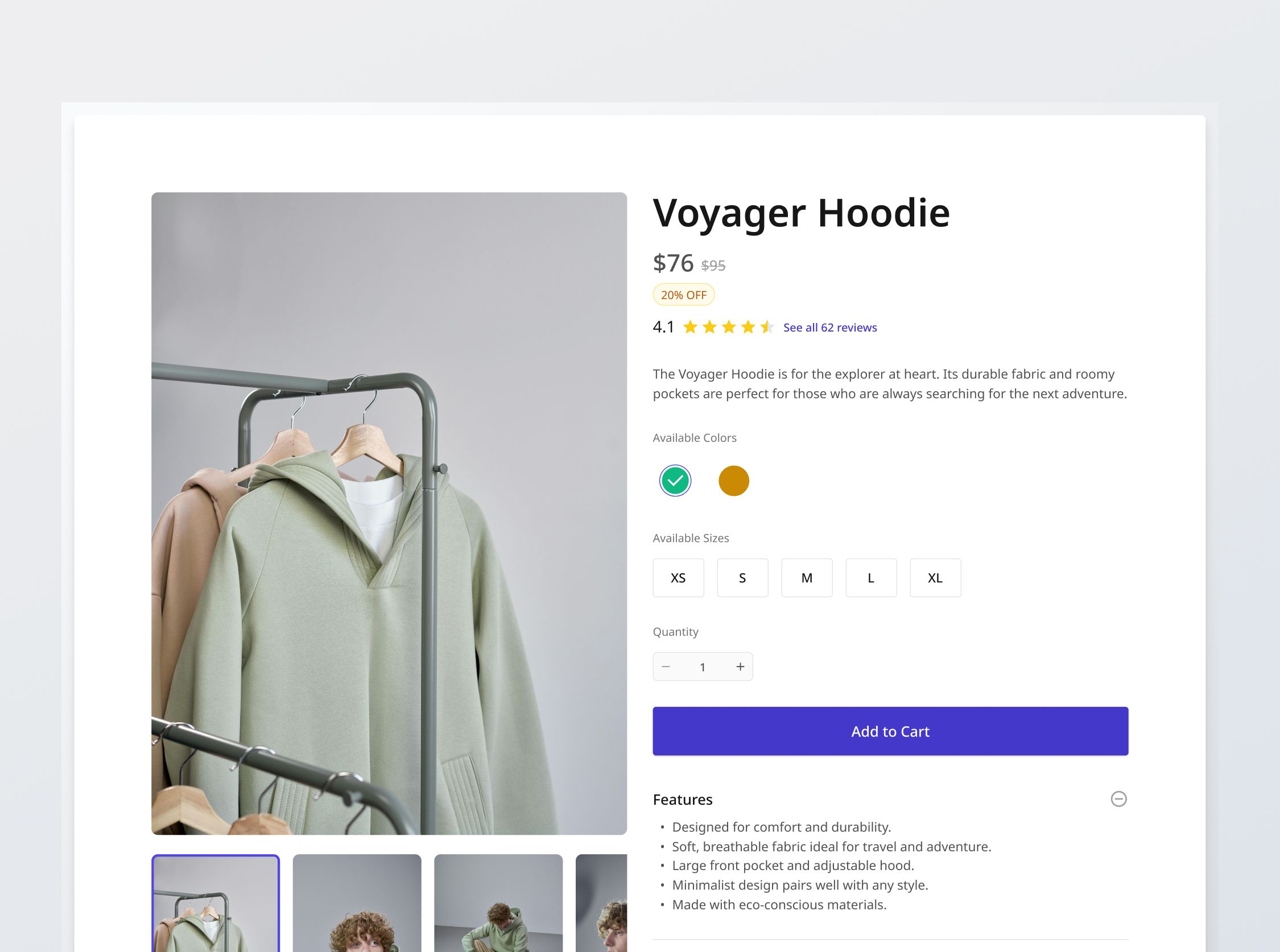
Product Details Section

Project brief
In this challenge, you will develop a fully functional and responsive product details section for a fictional e-commerce platform. The section will reflect selected product options, product review ratings, a gallery of product images, and include essential information like fabric care and shipping. Images, prices will dynamically update according to the color and size options selected by the user.
You will be provided with designs that have been adapted for mobile, tablet, and desktop interfaces. You will also be provided with data from a realistic, fictional e-commerce platform, pertaining to a sizable quantity of product listings.
To complete the functionality of the section, you will need to build the Product Reviews challenge next (which is opened by clicking on the "See all reviews" button, or the "Be the first" button). You will also have to dynamically update the user's Shopping Cart when they click on "Add to Cart" in the E-commerce Website challenge.
Implementation requirements
Your product details page implementation should dynamically adapt to reflect the specific product being displayed, effectively managing the unique characteristics presented by each of the 20 product listings in the data.
Price and discounts
- List price vs Sale price: If there is a platform discount available, display the discount label (different for percentage and cash discounts) and the list price with a strikethrough. Otherwise, display only the list price.
Product reviews
- If there are reviews, display the average rating and rating stars. Also provide a link for users to view all reviews, which includes the number of reviews that contributed to the rating.
- If there are no reviews, display the rating as 0 and empty rating stars. Display the line "No reviews yet. Be the first" where "Be the first" is a link that leads to a future "Write a review" page.
Product image gallery
- Display any number of images: The gallery should dynamically display anywhere from one to two, three or more than 3 images. For more than 3 images, users should have the ability to scroll horizontally to view all available thumbnails.
- Selecting a thumbnail: When a user clicks on an image thumbnail, that image should become the active display.
- Dynamically updated according to chosen color: Since product images are assigned on the color variant level, the product images shown in the gallery will change according to the color option currently selected.
Product options
- Color options: Only type of product option with a special UI - displayed as "color swatches".
- Displays any one of the 10 possible colors according to the options available for the product listing.
- Has Normal, Hover, Focus, Selected, Out-of-stock and Selected: Out-of-stock states.
- By default, the first color should be selected.
- Only a single color can be selected at once.
- Other product options: There are only color and size options.
- For XS-XL sizes, we display according to the design, in Normal, Hover, Focus, Selected and Out-of-stock and Selected: Out-of-stock states.
- For 4-12 sizes (shoe sizes), we display those values with the same UI.
- By default, the first size should be selected.
- Only a single size can be selected at once.
- Determining availability: As mentioned in the "Appendix" section, stock is tracked on the product variant level.
- Whenever a color is selected, check which "Available sizes" of the color are out-of-stock, and display those size options using the out-of-stock state.
- Selecting out-of-stock variants: When an out-of-stock color or size is selected, it should disable the "-" and "+" steppers of the quantity modifier (stuck at 0), disable the "Add to Cart" button, and display a message "Sorry, this item is out of stock".
- Effect on product gallery: Since product images are assigned on the color variant level, the product images shown in the gallery will change according to the color option currently selected.
Quantity modifier and add to cart
- The "-" and "+" buttons control the quantity of the item to be added to the user's cart when the user clicks "Add to Cart".
- Quantity can only be decreased till 1 ("-" will be disabled), and increased till the maximum stock of the item ("+" will be disabled, with an "Insufficient stock" tooltip).
Information accordion section
- Each product listing's features, as provided in the data, should be displayed in the accordion where users can tap to expand or collapse the information. This may include "Features", "Fabric & Care", "Shipping", and more.
General requirements
- Design fidelity: Aim to follow the design as closely as possible. All elements in the design should be present, using the specified text color, font size, font weight, spacing, dimensions, etc.
- Button / link states: Implement and style buttons / links to reflect different states - normal, hover, and disabled.
- Responsive behavior:
- Text size: Should be responsive; font size is larger for wider devices, smaller for narrow devices.
- Responsive layout: The content should stack vertically on smaller screens and align horizontally as the screen width increases.
- Cross-browser compatibility: Check that your solution works for major browsers including Chrome, Firefox, and Safari.
- [Stretch goal] Performance optimization: Code for fast load times with efficient CSS and JavaScript techniques.
- [Stretch goal] Accessibility and semantics: Follow best practices for web accessibility, such as using semantic HTML and ARIA roles where necessary and using proper
alttags for images. - Data handling: You will be provided with data relevant to this project, including product listings available on the fictional e-commerce platform and their specific details.
- [Stretch goal] Database population: It is recommended to populate a database with the data for a more realistic implementation; however, client-side data handling is also acceptable.

