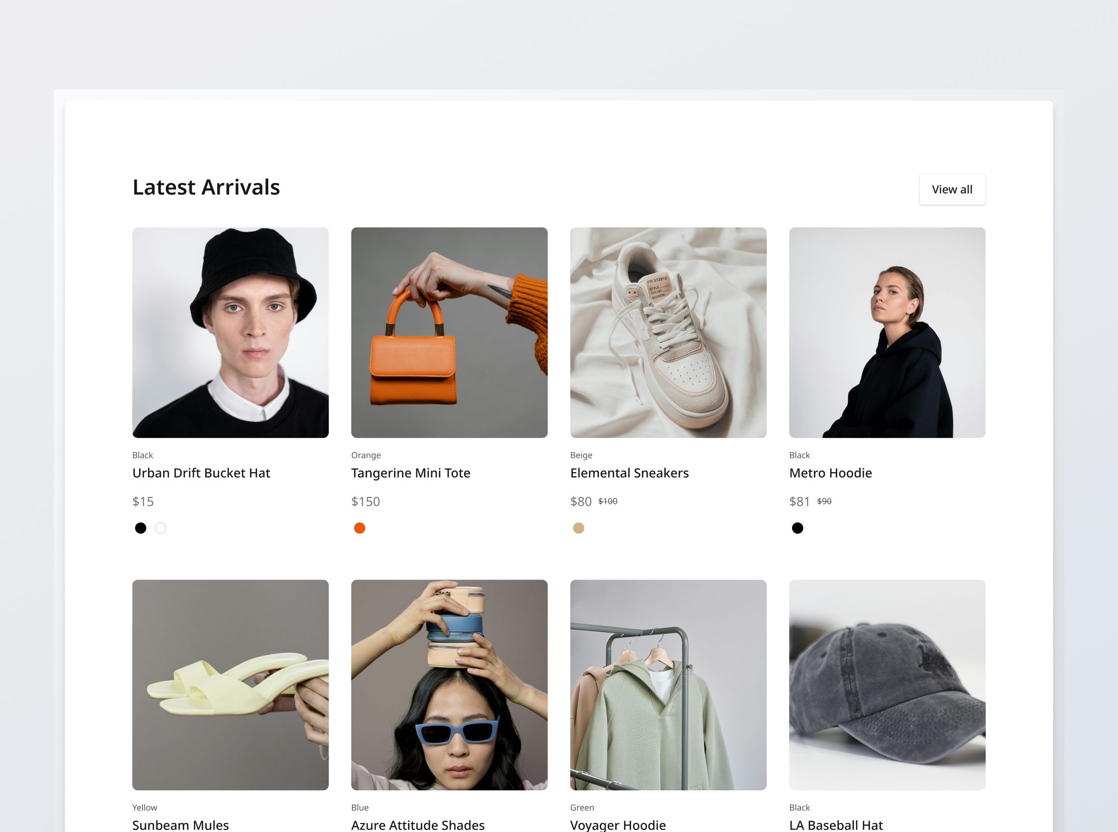
Product Grid Section

Project brief
In this challenge, you will develop a responsive and modular section that displays featured product listings in a grid. You should develop it based on the supplied designs, which have been adapted for desktop, tablet and mobile views.
This section is a 4-column grid. It should be built with reusability and modularity in mind, configurable to display sufficient rows based on the available product listing items.
You will be provided with data pertaining to the "Latest Arrivals" collection to display in this section. To complete the functionality of this section, you should build the Product Details Section (to which each product listing card should redirect to) and the Product Listing Section (to which the "View all" button should lead to, with the listings filtered by the relevant collection). The section's title should also be configurable.
Implementation requirements
Product grid
- Product listing cards: Implement and style product listing cards to reflect different states - normal, hover, and focus.
- Price to display: For listings that feature multiple variants with potentially varying prices, the displayed price should be that of the lowest-priced option for default color.
- List price vs Sale price: If there is a platform discount available,display the list price with a strikethrough. Otherwise, display only the list price.
- Color swatches on Product card:
- Color swatch states: Implement states and display them dynamically according to the status of the variant's availability - Normal, Hover, Focus Selected, Out-of-stock and Selected: out-of-stock.
- Effect of selecting a swatch: Selecting a color swatch should change the product image to display the product in that color, if images in that color are available. The variant color label (displayed above the product name in each product listing card) should also be updated.
- Responsive behavior: The content should stack vertically on smaller screens and align horizontally as the screen width increases.
- Empty state: If the current filters applied results in an empty product list, then display the given empty state.
Dynamic display
- Modularity and configurability: The component should be built to be reusable and modular, displaying any list of product listings, and also capped at a certain number of listings per section. The section's title should also be configurable.
- Latest arrivals: Fetch the product listings belonging to the "Latest Arrivals" section and display them.
General requirements
- Design fidelity: Aim to follow the design as closely as possible. All elements in the design should be present, using the specified text color, font size, font weight, spacing, dimensions, etc.
- Cross-browser compatibility: Check that your solution works for major browsers including Chrome, Firefox, and Safari.
- [Stretch goal] Performance optimization: Code for fast load times with efficient CSS and JavaScript techniques.
- [Stretch goal] Accessibility and semantics: Follow best practices for web accessibility, such as using semantic HTML and ARIA roles where necessary and using proper
alttags for images.

